This is a case study for the design of Zette’s chrome extension from idea to alpha launch.
Design Challenge
Design a chrome extension and dashboard that acts as an online wallet that enables users access to news articles from multiple publishers rather than subscribing to one single news source.
Research shows that consumers who do pay for news only pay for a single subscription and are frequently barred from reading paywalled content from other sources. The Zette chrome extension breaks down these barriers and allows access to premium content from multiple sources.
Project Details
July 2020 | Duration: On-going, Part-time | ~20 hrs. per week
Team: Product Manager (CEO of Zette), Product/UX designer (My role), Visual designer, Front-end developer, Backend developer
My Responsibilities
Product and UX design | Design lead
As the lead designer responsible for this project I conducted research, produced sketches, wireframes, and mockups. I managed a visual designer and helped define brand identity and brand assets. I delivered final assets and documents, verified the development and the live product, and iterated again for multiple rounds.
Tools
Figma | JIRA | Sendgrid | Firebase | Typeform

Strategy and Learning
We approached the problem from two sides. The product team conducted interviews to better understand how people consume news and to verify we were solving a consumer pain point; while the design team looked deeper into chrome extension user behavior.
User interviews and surveys
From the user interviews and surveys the team was able to take away several key insights on user behavior.
Persona
I developed a user persona to help guide the design process and help us maintain focus on who we were building for.
Comparative Assessment
We chose several popular chrome extensions that we liked and evaluated them on (1) Design (2) Features and functionality (3) Intuitiveness (4) Continuity (5) Strengths, weaknesses and opportunities using the results to help guide our design direction.
Features and flows
We defined the key features and prioritized which needed to be include in preparation for the alpha launch. I then defined the user stories and user flows from there.
Journey Maps
I mapped out the primary user journey’s to start to visualize how a user would move through the product.
User Flows
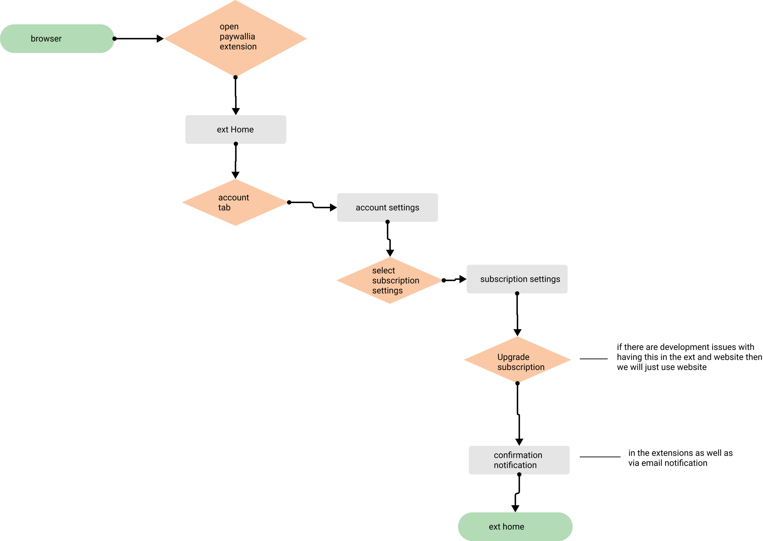
Digging further into the requirements and the user stories I developed the main user flows.

Setting the design direction
After synthesizing our user research and building the key user flows we were confident in our strategy and I began to define our design direction
Sketches
Starting with some white boarding I started to layout the main screens and key touch points the user would be interacting with.
LoFi Wireframes
I used my sketches as a guide to put together some LoFi wireframes to better conceptualize layout and sizing of elements as well as to start to verify the general flows.
HiFi Mock-ups
I did several iterations of the chrome extension design before developing the HiFi mock-ups to be used for prototype testing. I focused on the chrome extension first because of screen size limitations and then transferred those into designs for the web.

Design iterations and development
After doing some task based user testing the designs were in a place we could hand off to our dev team. They began coding the designs as we continued to iterate on various other parts of the product.
Polishing the sign up flow
We scrutinized the sign up flow to make sure we weren’t loosing customers before we had an opportunity to delight them with our product. We ended up with a smooth intuitive process.
Testing the primary use case
Iterating on our first designs we simplified the ‘Zette’ pop up making it more accessible and almost automatic; using Zette became second nature.
“It popped up as soon as there was a paywall; I didn’t even know there was a paywall, but it popped up and there was an easy button to click, so I just clicked it.”
Making sure we are giving our users feedback
Through user testing I realized we needed to give our users better feedback throughout their experience. We made sure to put a lot of thought into affirming feedback and robust error states for when things didn’t go quite as planned.
Design System
While working through the UX design process we worked with a visual designer to help define the tone of the brand and a visual language. Furthermore, as we finalized designs I started to build out a design system to allow for rapid and consistent product development as we expand the product functionality.
Speed bump in the roadmap
As we geared up for alpha launch we ran into a huge challenge. Zette was denied by the chrome store and we needed to design a work around for users to be onboarded. This was harder than anticipated because we were diverging from what users typically expect. After several rounds of user testing and a couple design iterations we ended up with a pretty solid sign on tutorial.
Final designs
We continue to develop the code to match our designs while we iterate on our product roadmap and add more features based on the feedback from our alpha users.
Retrospective
Serving as the UX Lead on this project it helped me learn the value of focus, compromise, and leadership. Being a dispersed team with limited resources highlighted the importance of communication and extreme focus on our goal and our timeline. We often had to pivot from our original ideas due to dev bandwidth or technological set backs which led to delays in getting our alpha product in the hands of real users, but the team continued to deliver despite these compromises.
I know we have a long way to go before this product is developed to a level where our users are falling in love with it, but I am proud of what we achieved in a short time period and I think we have laid a strong ground work for the growth of Zette.
The team is a hyper thoughtful group that scrutinizes over the small details which will shape the company for years to come.


